⚡️ Introduction
Loaders play an essential role in any application. It gives a sense to a user to wait till the website is loading. It is always better to display a loader instead of a blank screen. In this series of blog, we will be making CSS loaders from scratch which you can integrate into any web application you are building.
There are mostly going to be 3 articles in this series.
👨🏻💻 Let's code
In this blog, we'll be making a CSS loader from scratch. 👇

Open a text editor of your choice or you can even use Codepen.
Create two files,
index.htmlandstyle.css.Let's create a
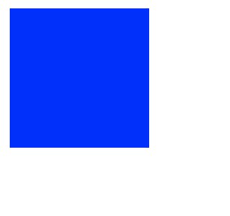
divelement and give it a width and height of100pxwith some background colour.<div class="loader"></div>.loader{ width:100px; height:100px; background-color:blue; }It will look like this-
Now inorder to make it circular we'll give it a
border-radiusof50%.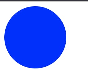
Now we want the background colour to be transparent and only borders should have a blue colour. To do that we'll make the following changes.
.loader{
width:100px;
height:100px;
background-color:transparent;
border-radius:50%;
border: 12px transparent solid;
border-top:12px blue solid;;
border-bottom: 12px blue solid;
}
We are almost there. To make this
divrotate we need to use CSS animations. We'll usekeyframes@keyframes rotate{ 0%{ transform: rotate(0deg); } 100%{ transform: rotate(360deg); } }In this, we create a keyframe -
rotatewhich rotates thedivelement from0degto360deg.Now we'll use this keyframe in the animation property.
animation: rotate 2s linear infinite;In this,
2s is the animation duration,linear is the animation-timing-functionandinfinite is the animation-iteration-count.After this out loader will look like -
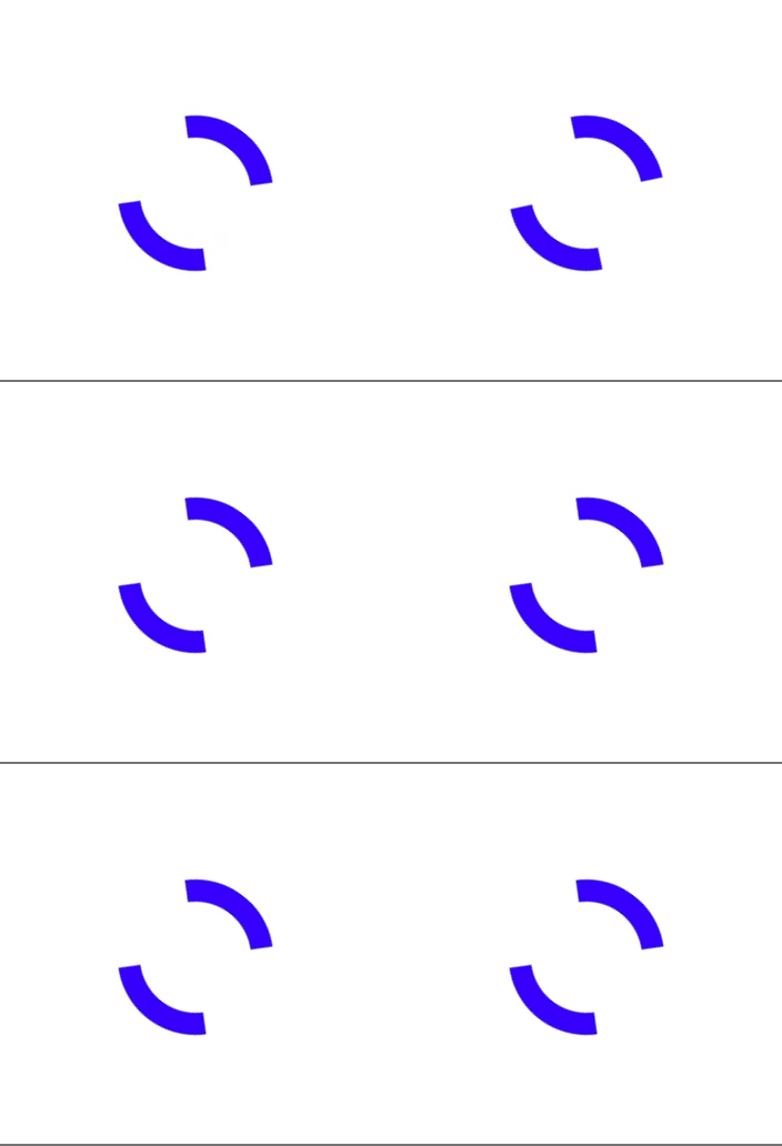
You can find the Codepen link here -
That's all for this blog 😁.
I hope you liked this post. Happy Learning ⚡️
📢 Stay tuned
This was the first blog in the CSS loaders series. Stay tuned for the next blogs. I usually share my learning with the community, you can connect to me on Twitter, GitHub or LinkedIn. Subscribe to my newsletter for new blogs.
